 |
 |
 |
|
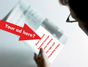
Marketing Matters Designing effective ads How to catch the reader’s eye and capture his or her business By Nanci Evarts Last month’s “Marketing Matters” column focused on developing an effective print advertising strategy and the “how to’s” of researching and choosing the most appropriate advertising vehicles. This month’s column will focus on the “creative” side—how to develop ads that deliver your company’s message in the effective and arresting ways. This is by far the greatest challenge: How can you make your advertisement stand out from other advertisers? How can you make sure your ad delivers the right message and delivers the message you intended? How can you create consistency in your branding and your messaging? A good test Within the insurance advertising arena, we’ve complicated these issues even further. In an industry that can often be accused of offering commodity products, many insurance advertisements are equally commoditized—generic, nonspecific claims and messages. Go through any publication and tear out your ads and those of your competitors. Cut out the name, logo and location of each advertiser. As you look through your pile of ads, divide them according to whether you find them appealing and informative or run-of-the-mill. Then critique them. Run-of-the-mill Generic messages: Many of the companies and their “wares” sound alike. The ads use similar words and phrases. It’s an easy trap any of us can fall into. Ultimately, some of the companies—including yours—may sound interchangeable. Lists: XYZ Insurance Services offers … followed by columns of generic coverages. If an ad for ABC Insurance Services lists the exact same coverages (see above)—and nothing else distinctive—how does the buyer distinguish between the two companies? Of course there are differences—in expertise, approach, scope, talent—but a list alone won’t make this important distinction. Don’t get me wrong; there’s nothing wrong with including a list of coverages—this makes for a quick, easy read—but the trick is putting the list into the context of the greater, unique value you deliver. Confusing, redundant copy: Some copy will be confusing, misleading, inaccurate or overblown. When everyone claims to be “the best,” who really is? Or the copy may say the same thing over and over again, rather than make several key points of benefit, value and differentiation. Poor copy can usually be attributed to a couple of factors. The copywriter may not truly understand the business or “get” what an organization does and how it does it. Or, just as likely, the client (the company) itself is struggling to articulate distinctive features, benefits and value that set their company apart. Hackneyed images: Today’s wealth of easy-to-obtain, “royalty-free” images is a cost effective boon to advertisers. The drawback is that all of the images start to look alike or even are exactly alike because everyone is purchasing from the same pool of images. For example, photos of things we insure—buildings, trucks, doctors, lawyers or Indian chiefs. Or generic people shots—lots of people in suits, talking, sitting around tables or shaking hands. Or traditional clip art. Of late, many advertisers slip into overdone metaphors—sports, mountain climbing, and so on. There is nothing wrong with these images or even the metaphors, but you have to select them based on the context of how you can add a new twist to make your images distinctive. Appealing & informative Buyer focused: The best ads speak to the needs of the buyer and are not just a one-sided perspective of what you want or need to sell. The process begins with knowing who your target is, what it needs, and what it needs to know about you in order to choose you. For each target market, what makes your product, service, and company of value to it? If you have multiple targets, you may end up developing different ads for different audiences or targets. This approach even weaves its way into the precise sentence structure. The copy should almost always be in the “you” voice of the buyer, not the “me” voice of the advertiser. This means writing about benefits and features from the buyer’s perspective, in language that the buyer can relate to, respond to, and be comfortable with. Targeted message: Your concept will also be driven by your overall marketing objectives and the sales environment. The language, tone, and style of your advertising are likely to vary depending on whether you’re reinforcing a long-held position, launching a new product or service, expanding your firm and capabilities, entering a new market, and so on. You also want to design an ad in the context of your competitive environment. Review your competitors’ ads, as well as the advertising of a similar business or service. Look at these ads from both a message and image standpoint. How are they appealing to these buyers? Where does it make sense to emulate what they are doing, and where does it make sense to counter what they are doing to gain a competitive advantage? Creative thinking: A good ad results from creative thinking before any copy is written or image is chosen. The ad’s creativity and effectiveness are driven by identifying an overall theme or concept that represents your company, and are carried through all your ads over a given period of time (say 18 months). The basis of the concept should be your company’s unique corporate culture or personality. The headlines, copy, and imagery that follow will reflect this overall concept. The right stuff: No doubt about it, good copywriting is an art. Advertisements are often best developed (with your input, of course) by professional ad agencies. Good copy is a unique blend of clarity and cleverness, brevity and energy. Good copy presents the company—not just the product or service—in a stronger, more compelling light by the way the facts or claims are presented. And the copy culminates in a strong call to action, a reason to pick up the phone, visit the Web site or send an e-mail. Compelling images: It takes effort, talent, and resources to find images that are compelling or unexpected and that return value in the readership surveys of your ad. In addition to royalty-free images, you’ll want to explore stock or even custom photography or artwork. Not using illustrations is another option. If you have arresting headlines and copy, it can be effective to use an “all type” approach with no image at all. Other options: In addition to the traditional “page” advertising, you can consider different formats such as tip-ins, inserts, poly-bagged brochures and belly-bands. As far as size, color, style, and format go, the choices are far too vast, complex, and individualistic to cover in a single article or in a blanket manner. The decisions will be driven strategically—what you are trying to accomplish and what impact you wish to make—as well as practically—budget and availability of internal and external resources. Intriguing approaches A number of insurance advertisers have recently attracted my attention. Even if your budget can’t match some of these companies, their approach can inspire approaches within your own budget. • Travelers. Their recent “in-synch” campaign is fresh and thought provoking. • Beazley Syndicate. Intriguing turn-the-page format; good use of the “you” voice highlighting the frustrations an agent or broker might experience with other London brokers too inexperienced or timid to take a stand. • Aon Specialty Product Network. Unique inserts and “tip-ins” that focus attention and provide additional information or “take-away” value to the reader. • SRS (Specialty Risk Services). Great continuity and brand consistency over the past three to four years using “impressionist” painting imagery tied to the “artistry” of their services. Very distinctive and “different” in the insurance trade publications. • Principal Financial. Innovative illustration tied to their logo captures attention and reinforces their name. • AIG. Both in print and broadcast, a similar approach to creatively reinforce their name and brand. • Safeco Insurance. “Clock” ad. Quick response is frequently touted by carriers, retailers, and wholesalers. This clever ad not only “says” it but graphically demonstrates a pledge to a response time of 15 minutes. • PMA Insurance Group. Arresting, innovative graphics; customer satisfaction claims backed up not just with words but with statistics. • Doris. Their agency management system ads include fun illustrations that reinforce the words of the message. Your next campaign After studying these successful advertisements, you’ll have a stack of possibilities for either developing your own ad or talking with your creative vendor—graphic designer, ad agency or consultant. You’ll have a clear idea of the kind of ad you want to emulate or the kind you want to avoid. * The author |
|
|||||||||||||
| ||||||||||||||