

|
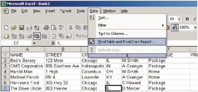
Maximizing Automation Taming the data monster with Excel Part II—PivotTables By Wanda Shumaker In Part I, which appeared in the September issue of Rough Notes, we discovered that learning some of the basic formulas and functions of Excel makes sorting and filtering an unwieldy data set much easier. Yet even with those capabilities, you still may find yourself with seemingly endless lists when all you really want is a brief synopsis of the information. Subtotals can be used and “collapsed” for summary, but there is another Excel feature that makes short work out of large data sets: PivotTables. Using the example below, we have a data set with name, address, city, state, coverage type, premium, expiration year, commission, company, and producer. In this exercise, we will create a brief report showing premium breakdown by state, with premium shown highest to lowest value in the list. Exercise #1 1. To create the Excel PivotTable®, place your cursor anywhere inside the data set (in one cell only). From the menu bar select Data then PivotTable and PivotChart Report (Figure 1) to launch the PivotTable Wizard.
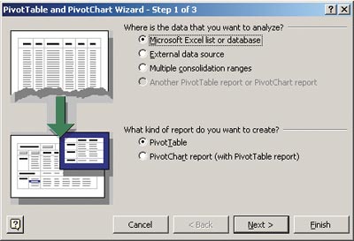
2. In Wizard step 1 of 3, the default choices are sufficient, so click the Next button. (see arrow, Figure 2)
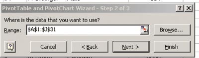
3. In Wizard step 2 of 3, the question, “Where is the data that you want to use?” appears. If you appropriately positioned your cursor in step 1, the Wizard should automatically select your entire spreadsheet as the source of the PivotTable, and all you should have to do is select Next. (Figure 3)
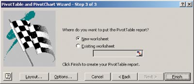
Note: If you are using some other data source, such as a DBASE source or a comma-delimited data source, you may need to click and drag the desired data on the spreadsheet either before beginning the Wizard or once you are in this step. On the spreadsheet you will see the data surrounded by the “flashing marquis” border. 4. Wizard step 3 of 3 asks where you want to put the final report. Typically your response would be a New Worksheet. (Figure 4)
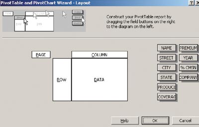
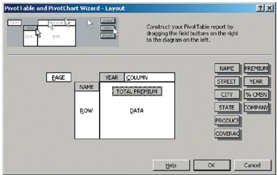
5. From Wizard step 3 of 3, click the Layout button next to create your PivotTable report. (Figure 4 again) 6. In the PivotTable Layout dialogue box, you will see a grid indicating various components of your final output, including Page, Column, Row, and Data fields. To the right of that grid, you will see the boxes that contain your spreadsheet column headers. You will click and drag these “fields” into the grid to design your final report outcome. (Figure 5)
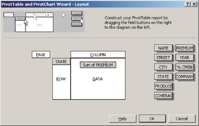
7. For our “premium by state” report, point your mouse on the State box, then click and drag the box to the Row grid and drop it. Do the same to the Premium column, only drop it in the Data part of the grid. Items in the Data grid section will assume that some sort of “calculation” (usually Sum or Count) will be performed on that field. In our example, since the premium field is a numeric data field, Excel assumes you want a Sum of Premium. (Figure 6)
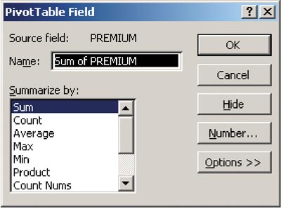
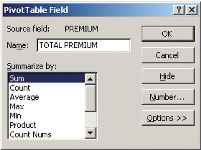
a. Format the number output. Typically, data output is presented in a “general” format. If you want your numeric fields to return dollar signs, commas and other numeric accounting formats, you can format those fields for the desired output. Simply double click on the Sum of Premium field to open a formatting dialogue box. In the PivotTable Field dialogue box, you can determine whether you want Sum, Count, or other calculations in your summary. We want the Sum of Premium, so this will not be changed. (Figure 7)
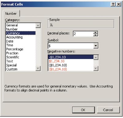
b. To format the Number appearance, from the PivotTable Field, click the Number button. Select the Currency option and set your preference for the appearance of negative numbers, as well as the number of decimal places. The default is 2, but if you want your values to be rounded to the next dollar value, set the decimal places to zero. Click OK when complete. (Figure 8)
c. The PivotTable Field box will appear again. (Figure 9) Note also that if you want to customize the label or “name” of the final output, you can do so. In our example, we changed Sum of Premium to Total Premium (field name for the total must be different than the original field name). This is helpful if your data fields are written in “computer lingo” and you want your report output to be “reader friendly.” Click OK to exit back to the PivotTable Layout screen.
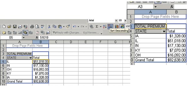
8. You will be brought back to the PivotTable Wizard step 3 of 3 dialogue box. Click Finish to view your final report. (Figure 10)
9. Your final report should list the states along with the premiums for each state. (Figure 11) To sort the premium field by high-low value, simply click inside one of the premium amount fields, then select the ZA sort button to sort your data high to low. (Figure 12) This can also be found in the Data-Sort menu option if the shortcut ZA sort button is not visible on your toolbar.
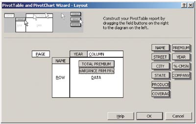
Exercise #2 1. Set up your Layout screen to show the Client Name or ID code in the Row field, with the Year in the column field and the Total Premium in the Data field. (Figure 13)
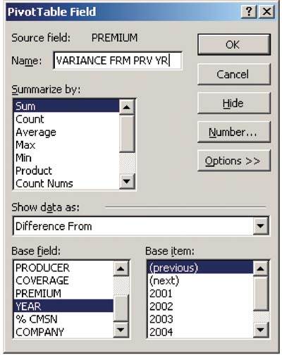
2. Consider adding a second Data field to show the variance from the previous year. Simply click and drag a second Premium field into the Data grid, then double click to get to the PivotTable Field box. (Figure 14)
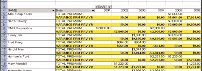
3. Click on the Options button, then select from Show Data As the “difference from” option. Use the Base Field as Year, then Base Item, as “previous.” Change the name of the field to Variance from Prev Yr, then click OK. (Figure 14 again) 4. The Layout screen should now show both Data fields, one for the Total Premium for that year and another showing the Variance from the Previous Year. Note that for years not included in the data set, there will be no variance amounts shown. (Figures 15, 16)
5. You are not required to put the Premium and the Variance fields into the Data grid—if you simply want to see the variance, just leave the Total Premium block out of the grid. (Figures 15, 16) As noted in Part I, the consistency of your data is critical to obtaining believable report output, and understanding your basic reporting and data storage is fundamental. Neither Excel nor any other program will solve poor data entry procedures. However, if your data house is in order and you know where to go to retrieve the needed information, an Excel spreadsheet can be easily posted to a shared, and password secured, network folder for viewing purposes and collaboration. If you are swimming in piles of printed reports, consider enhancing and streamlining your reporting efforts with Excel. Next time: Part III—Putting your best foot forward with charts and graphs and customizing the printed output. * |
||||||||||||||||||||||||||||||
|