Tactical Tech
Make lasting first impressions with consistent design elements and logos
Have you ever logged onto the Internet, social media, or another digital platform and had a brand jump out at you the moment you saw it? Major brands such as Apple, Nike, and McDonald’s have pushed their products and services to an entire new level through the power of their brand.
Your agency can do the same. In fact, many agencies already have taken the time to re-evaluate their brand, and that now is the driving force for all of their marketing efforts.
The most effective way to start resonating with clients instead of simply making first impressions is with a powerful brand. To establish one, you must maintain consistency in brand across all platforms.
Our colors speak to the pride we have in our country and show our commitment to protecting the American Dream through insurance. Our color blue also helps our audience psychologically associate our agency with the concept of trust; it helps us start off our new relationships on the right foot.
That’s where a branding guide comes in handy. Not only does it help you get where you need to be with your brand, but also it lays the foundation for your brand to help you become more identifiable to prospects and current customers. Remember, when going up against big-name insurers like GEICO or Progressive or larger independent agencies, you’ll need to stand out.
A lasting first impression
As an agency owner, you probably go above and beyond to create a positive and memorable experience for your clients. Your brand needs a strong foundation, a compelling identity, and consistency. A weak or poorly articulated brand can make your agency look unprofessional and create a poor first impression for an online prospect.
First impressions are critical. That’s why your brand should be streamed through all of your marketing content, both digitally and in print. It’s why every detail of our agency’s brand is clearly laid out in our branding guide. Whenever our marketing team creates content to boost agency visibility, they do so in accordance with our branding guide; this keeps our agency’s brand strong and consistent.
Logo
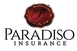
A cornerstone of our brand is our logo. If you were to open the Paradiso Insurance branding guide, you’d see two versions of our logo—a detailed version and simplified one. The detailed logo shows the Paradiso “P” in an elaborate wax seal that appears to be three dimensional. It’s used on printed material, such as our business cards, our letterhead, and mailers that contain our Paradiso Promises.
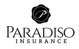
Our simplified version is a two-dimensional version of the detailed logo. It’s used where the detailed version won’t work. You can find it on T-shirts, promotional items, and visuals where the detailed version can’t be easily seen, such as a billboard.
Our branding guide describes the appropriate uses of both logos and provides examples of poor use to help us avoid mistakes.
Neither version can be placed on busy backgrounds or patterns, and they can’t be manipulated in ways that change the font or design. This ensures that we are consistent wherever we place our logo and that our logos can always be easily read by our audience.
These fundamentals are important for logos in any industry. If your customers can’t recognize your logo immediately, or if there isn’t an underlying reason for your design choices, you may want to consider revisiting your agency’s brand. Your agency’s logo is placed in a wide variety of media, so it’s important that it makes a strong impression with your audience.
In our branding guide, we define three primary branded colors for our agency to use: blue, red, and ivory. Our secondary colors—gray, khaki, yellow, and green—are used to highlight more specific aspects of our agency’s brand.
We have talked about the psychology behind color choices in the past, where we detailed the mental connotations your audience will make with your choice of colors. If you aren’t familiar with the psychology of colors in your marketing endeavors, you can gain understanding through an explanation of why we use the colors we’ve chosen.
Our branded blue is the core color of our agency’s brand, and when it’s paired with our other colors it showcases our agency’s three primary focuses: the American Dream, content geared to our personal lines audience, and content geared to our commercial lines accounts.
We use blue and red when talking about our core message, the American Dream. For personal lines we use blue and yellow, especially when we are talking about family. We use blue and green when our posts are talking about cost. For commercial lines, blue and ivory are used when talking about general policies, while blue and khaki are used to convey a message about how our services prevent office and home life from overlapping. Finally, we use blue and gray to focus on specific commercial policies, such as workers comp, that are targeted toward a blue-collar demographic.
Additionally, to maintain consistency across every visual we create, our marketing team uses a list of HEX values—a set of numbers that, when input into a design program, enable the computer to understand the exact color we want. This keeps our primary and secondary colors consistent, digitally and in print. Color consistency is a key element of branding because it helps your audience identify the message behind your content even before they read what it’s about.
Our colors speak to the pride we have in our country and show our commitment to protecting the American Dream through insurance. Our color blue helps our audience psychologically associate our agency with the concept of trust; it helps us start off our new relationships on the right foot. We want our clients to feel a sense of security and understanding when they see our content, and we want to become their trusted advisors in everything that pertains to insurance. Although we can generate these feelings in person, our content continues to evoke that emotion even when we aren’t physically with a client or prospect.
Design elements
Every design choice you make must support your brand’s identity.
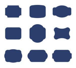
Our marketing team uses the same set of design elements each time they craft visual content. These elements contain our branded colors and are simple shapes we use as a backdrop for text when it is being placed on an image.
The shapes of these graphic elements help reinforce our identity in a small community. In fact, these design choices were inspired by the old signage typically found in New England. This generates a feeling of familiarity and belonging among those who grew up in town or around the area. The shapes of the elements reinforce the nostalgia and American pride we communicate throughout our content.
Although elements of our shapes can be resized to fit a certain visual, we do not change the overall color or shape. We have a variety of elements in different colors but typically stick with red and blue elements because our agency’s core message is about protecting the American Dream.
Some agencies use a number of different fonts. In most cases it’s best to keep things simple. If you keep using different fonts, it will be impossible for your audience to immediately identify your content. Remember, you want to stand out, but you don’t want to go so far that your audience can’t identify or comprehend your content.
Our agency uses two fonts on a consistent basis: ASAP and Sacramento. ASAP is the main font we use for our marketing materials, such as letters, postcards, visuals, blog covers, and so on. We use Sacramento to highlight key phrases or titles in our text. Not only does this make the keyword stand out, but because Sacramento is a script font, it evokes a dreamlike feeling of nostalgia and American pride similar to our other design choices.
You shouldn’t use these fonts just because our agency does. Remember, our branding guide has been laid out so that everything makes sense for our brand. Without a core brand concept, the font you use won’t matter.
In our next column we’ll look at other visual brand elements, including photography and video, and then we’ll wrap it all up. In the meantime, start thinking about how creating a branding guide can help you move forward.
The author
Chris Paradiso, CPIA, is president of Paradiso Financial & Insurance Services, headquartered in Stafford Springs, Connecticut. His agency won PIA National’s Excellence in Social Media Award in 2013. He also heads up Paradiso Presents, LLC, which provides social media consulting, seminars and workshops to help agencies thrive in the online marketing world. Contact Chris via email at cparadiso@paradisoinsurance.com


